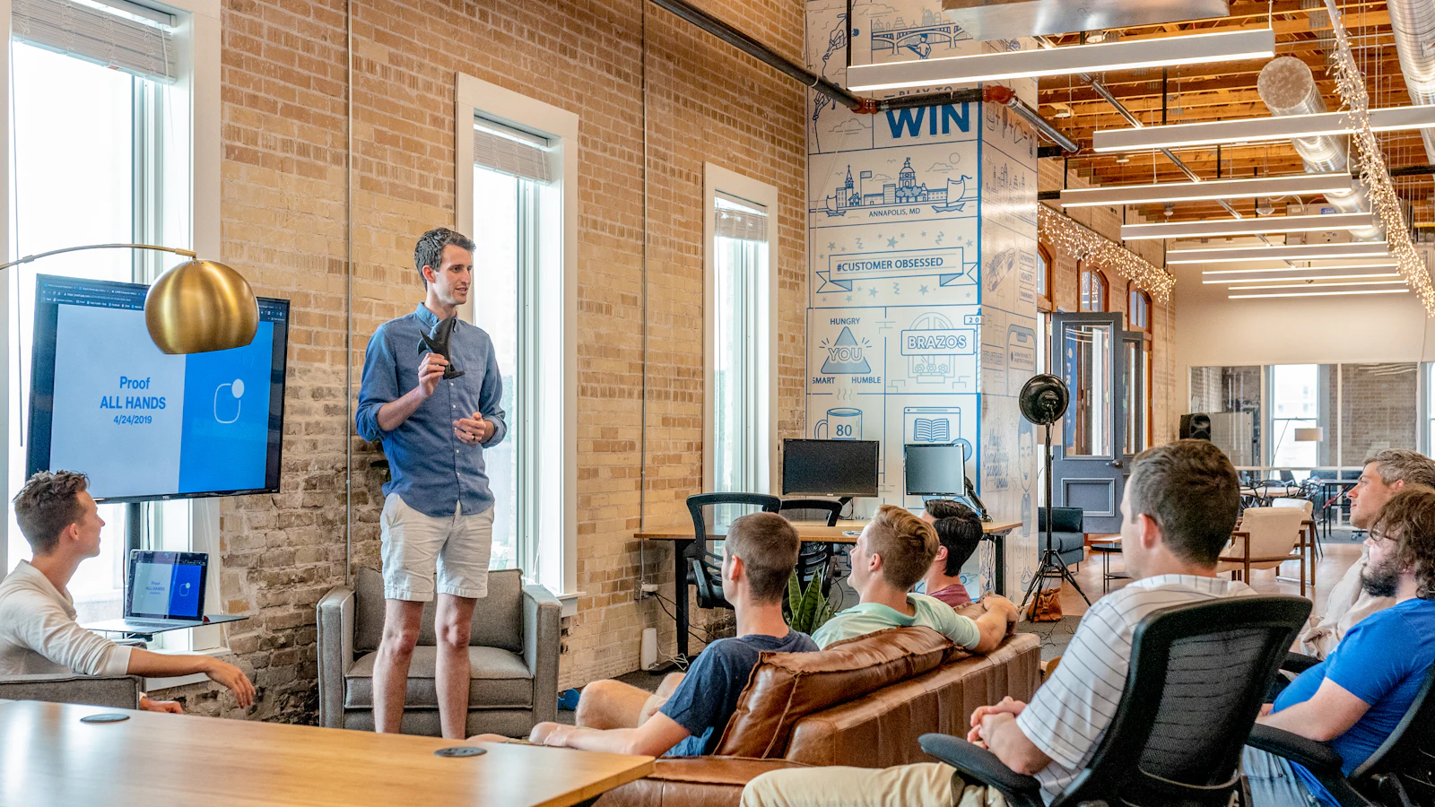
The quiet operators rebuilding a city's manufacturing base.
For three years, a coalition of second-generation owners has been re-tooling without press, without funding rounds, and without a single LinkedIn post.
BizHubNetwork™ is built from a small, deliberate kit of editorial primitives — typography, color, covers, cards. Every future page is assembled from this system, never improvised around it.
The masthead carries the institution. A serif wordmark, a hairline rule, primary editorial sections, and a single utility for search and subscription.
Demonstrated live above. Includes responsive mobile sheet, inline search, and the persistent volume/issue marker on desktop.
Fraunces for display and headlines. Inter Tight for interface and body. JetBrains Mono for eyebrows and metadata. No third display face — restraint is the system.
Lead body — sets the tone of the piece in a slightly larger, lighter register. Used for the opening paragraphs of an editorial story.
Standard body — the primary reading register. Optimized for long-form attention, with generous leading and a measured line length to support sustained reading across desktop and mobile.
“A story is not invented. It is uncovered, verified, and then preserved with the same care as the institutions it documents.”
Caption — used beneath imagery, charts, and footnotes. Italic, muted, never decorative.
Cards are reading invitations, not marketing tiles. Hairline borders, no shadows, no gradients. Each variant carries its theme accent.
For three years, a coalition of second-generation owners has been re-tooling without press, without funding rounds, and without a single LinkedIn post.
What four years of cold outreach actually looks like.
An overlooked filing becomes the foundation of a new category.
The librarians knew the founders before the funds did.
Long-form profiles of operators working outside the coastal press cycle.
Second-generation owners reckoning with what they were handed.
Quantitative dispatches from regional economies the indexes miss.
We didn't have a pitch deck for the first six years. We had a job to finish.
My father didn't build a business. He built a way of doing things that outlived him.
Three forms only: primary, secondary, and the textual link. No icon buttons in body content. No gradients, no glow, no rounded pills.
A 12-column editorial grid (8 on tablet, 4 on mobile). Three content widths: narrow (720), default (1200), wide (1440). Generous vertical rhythm: 80px between major sections.
Paper and ink are the foundation. Gold is the institutional mark. Editorial red is reserved for masthead-level signaling. Grays carry hierarchy without volume.
Primary text & primary action
Default background
Inset panels
The signature mark
Hover, deep accents
Masthead only
Hairline borders
Metadata, captions
Photography is documentary, not decorative. Human, situated, with available light. Full-bleed wherever the frame can hold it. Never stock-look composites, never staged founders against neutral walls.
In situ — subjects photographed in the spaces where the work happens.
Available light, considered crop, no filter stack. The image is evidence.
One typographic frame, three tiers. The same masthead, the same hairlines, the same spine — so a Story, an Issue, and a Volume always read as one record.
BizHubNetwork™
BizHubNetwork™On work that compounds slowly enough to be missed by the cycle.
BizHubNetwork™Every story belongs to a theme. Themes carry a single accent color that travels across the story's eyebrow, card hairline, and cover spine — distinct enough to navigate, harmonized enough to belong.
Founders building from zero.
How decisions become direction.
Ideas that change the field.
The networks that carry the work.
Where momentum becomes access.
What endures after the headline.
The discipline behind the story.
Measurable change, documented.
Every page is composed from this kit. Import from @/components/editorial — never improvise. Below: the newsletter block, slotted into footers and story ends.